
You can create an org chart online, in Word or PowerPoint or with org chart software, and drawing it usually takes an afternoon. The fact-finding that makes it accurate and the maintenance that keeps it current take more time.
This guide shows what a good org chart delivers and which types of org chart exist. It compares tools from SmartArt to HR software and walks you through the fact-finding step by step. It comes with a free org chart template for PowerPoint and a table of responsibilities to copy. The final part covers how the org chart stays accurate months later.
What a good org chart shows - and what it doesn't
An org chart answers three questions at a glance: Who belongs to which department? Who reports to whom? And where does responsibility for a topic sit?
These questions come up more often than you might think. In a machine-building company with 80 people, the management team usually still has in mind who belongs where. The new head of sales needs an overview for that, the bank would like to see an organizational overview as part of a financing deal, and in an ISO 9001 audit an org chart is a common way to show how responsibilities and authorities are assigned (clause 5.3), even though the standard does not explicitly require one.
It is just as helpful to know what an org chart does not show:
- How work actually flows. The fact that Ms. Weber formally sits in accounting and in practice handles half of order processing doesn't appear in any box. That is what process documentation is for, and how a workflow runs across several departments is shown in a swimlane diagram.
- Who carries which knowledge. The org chart shows positions, and the knowledge silos behind them, meaning knowledge that depends on one individual person, stay invisible in it.
- Informal decision paths. In many family businesses, part of the decision-making runs alongside the formal lines, for example when the senior owner still has a say even though he no longer appears in any box.
An org chart, then, is a map of the formal structure. The flow of work is shown by the process map, and the two pictures together give a good overview of the company.
Types of org charts: line, line-and-staff, multi-line and matrix
Management theory distinguishes four basic forms, and the org chart looks different for each. On top of that there is the flat organization, which is common in small companies. Before you draw any boxes, it is worth checking which structure your company has.
Line organization. Every position has exactly one superior, and instructions travel along that single line only. The principle goes back to Henri Fayol and his "unity of command". The org chart is a clear tree. This form is typical for small firms and for trades and production, where clear ownership counts for more than short paths.
Line-and-staff organization. The single line stays, plus staff positions that advise management and have no authority to give instructions. Examples are quality management, controlling, executive assistant or data protection. In the org chart they hang off the side of the line. This is a very widespread form in mid-sized companies, and the template further down is built on it.
Multi-line organization. A position has several functional superiors, each for their own subject. The idea comes from Frederick W. Taylor's functional foremanship. Paths are short, and the instructions from different superiors need to be well coordinated. You recognize this form by boxes with more than one line going up.
Matrix organization. Two lines cross, usually function (engineering, purchasing) and project or product. Anyone working on a project has a functional and a project manager. A matrix org chart suits plant builders, engineering firms and agencies and needs clear rules on who decides in a conflict.
Flat organization. There is at most one level between management and the team, often none. This is typical for young companies, agencies and firms of up to about 30 people. The org chart is correspondingly wide and low. Here the roles say more than the boxes: who owns purchasing, IT or accounting, even if nobody holds the title? That is what the section on responsibilities further down is for.
| Type of org chart | Feature | Suits | Typical weakness |
|---|---|---|---|
| Line organization | one superior per position | small firms, clear workflows | long chains of command, overloaded management |
| Line-and-staff organization | line plus advisory staff positions | most mid-sized companies | staff without authority get bypassed |
| Multi-line organization | several functional superiors | specialized departments | contradictory instructions |
| Matrix organization | function and project cross | project-driven firms | conflicts over resources and priorities |
| Flat organization | hardly any levels between management and team | small teams, agencies, start-ups | unclear responsibilities, informal hierarchies |
In practice, hybrids are the rule. A line-and-staff structure for the core organization plus a matrix for two or three major projects is common in plant engineering. Draw the org chart the way instructions flow in your company, even where that differs from the textbook.
Org chart software and online tools compared
For most small and mid-sized companies, Word, PowerPoint or a free online tool like draw.io is enough to create an org chart. What matters for the choice is less the drawing and more how the org chart stays current.
| Tool | Free? | Strength | Upkeep |
|---|---|---|---|
| Word and PowerPoint (SmartArt) | included in Microsoft 365 | everyone knows it, quick for up to about 30 boxes | by hand, one file per version |
| Canva | free version with templates | professionally designed templates, appealing look | by hand |
| draw.io (diagrams.net) | yes, fully | in the browser or as a desktop app, good for large org charts | by hand |
| Lucidchart | free tier with limits | data import and automatic layout, depending on the plan | repeat the import after changes |
| HR software (e.g. Personio, HRworks) | part of the HR suite | current from master data | automatic, shows the formal hierarchy |
| AI interviews (e.g. wissa.ai) | free trial package | shows lived roles and responsibilities with sources, in-app view without image export | grows with every conversation |
Creating an org chart in Word and PowerPoint
Word and PowerPoint come with SmartArt, a ready-made hierarchy graphic you can fill in within minutes. In Microsoft 365 it works like this:
- Open the "Insert" tab and click "SmartArt".
- Choose the "Hierarchy" category on the left and the "Organization Chart" layout. Confirm with "OK".
- Enter names and roles in the text pane next to the graphic. Each line becomes a box, and indented lines sit one level lower.
- For more boxes, right-click a shape and choose "Add Shape". There you find "Add Shape Below" for team members and "Add Assistant" for staff positions.
- On the "SmartArt Design" tab you change colors and style. "Layout" sets whether teams are arranged side by side or hanging.
PowerPoint has a quick shortcut: write the structure as an indented bullet list and choose "Convert to SmartArt" from the context menu. Beyond about 30 boxes, SmartArt gets unwieldy. Then it's worth moving to draw.io or Lucidchart.
Creating an org chart online: Canva, Lucidchart, draw.io
Online tools run in the browser, need no installation and offer ready-made org chart templates. Three tools are widespread in mid-sized companies:
- Canva has many professionally designed templates and produces appealing results for presentations, websites or trade shows. The free version is enough for a single org chart.
- draw.io (diagrams.net) is completely free and open source. It runs in the browser or as a desktop app, saves locally or to OneDrive and Google Drive, and exports PDF, PNG and SVG.
- Lucidchart works as an org chart generator: depending on the plan, it builds the org chart from an employee list and arranges the boxes automatically. The free tier limits the number of documents.
Miro and Visio fall into the same category. All of these tools make drawing easier and look professional. Maintenance remains manual work: when the organization changes, someone updates the chart by hand or repeats the import.
HR software: automatically current, formal view
Personio, HRworks, Factorial and similar HR systems generate the org chart automatically from master data. When someone is hired or changes departments, the picture updates itself.
The hierarchy stays as current as the master data. For companies that plan to introduce HR software anyway, the org chart is a sensible byproduct. Introducing an HR suite just for the org chart, on the other hand, is a big step.
HR software shows the formal hierarchy, meaning who reports to whom. Who actually owns which processes and which role is filled twice or not at all isn't in the master data, since master data knows positions.
Org chart from interviews
An org chart can also grow out of conversations with employees. That is how wissa.ai works: an AI conducts interviews in a chat, around 15 to 20 minutes per conversation, whenever it suits the interviewee. Interviewees don't need an account of their own. The AI follows the knowledge from person to person, snowball-style, and suggests inviting the colleagues who get named.
With every interview, the org chart grows from the answers: who does what, who reports to whom and which roles are still unfilled. You also see where the conversations stand, meaning who has already talked and who is invited. If you add a planned target structure, wissa shows next to it where the current state differs.
When two people describe a responsibility differently, wissa flags the contradiction, and every statement stays traceable to its source. wissa shows the org chart in the app and does not export it as an image. For the slide in the bank meeting you therefore keep drawing it in PowerPoint or draw.io. wissa supplies the content for it, meaning who actually holds which role.
Step by step: an org chart that matches reality
You create an org chart in six steps: define the purpose, capture roles, ask the employees, clarify reporting lines, mark gaps and draw. Whichever tool you choose, the greatest value comes from the fact-finding.
Step 1: Define the purpose
An org chart for a bank meeting needs departments and leadership positions. An org chart for succession planning or a QM audit needs every role down to team level. For onboarding, it is the entry point into the onboarding plan and the onboarding checklist. Decide up front what the picture is meant for, because that determines the altitude.
Step 2: Capture roles, not just positions
First, collect the roles that exist in the company, regardless of who holds them. Examples are "quote preparation", "incoming goods inspection" or "IT administration". In a 60-person company, that can quickly add up to 40 to 80 roles, considerably more than positions.
That difference is revealing. A person with six roles carries a lot of responsibility alone, and a role nobody holds is an open spot in the workflow.
Step 3: Ask the people, not the job descriptions
Job descriptions say what someone should do. So ask the employees themselves, the same way you do as-is process mapping: "What do you do in a normal week? Who do you hand results to? Who comes to you for advice?"
Discrepancies will show up, such as the warehouse manager who also runs the vehicle fleet on the side. Or the clerk who has taken over the vacation planning for the whole department. Such discrepancies are among the most valuable insights of the whole exercise.
Step 4: Clarify reporting lines - including the uncomfortable ones
Draw the formal line (who has managerial authority) and note separately where the functional control deviates from it. If three people say "really, Mr. Krause decides that", but Mr. Krause holds no leadership position, you've learned something no template will tell you.
Step 5: Make gaps and pile-ups visible
Now the role list pays off. Mark roles with nobody in them and roles with exactly one knowledgeable person (bus factor of 1). Also mark people with a conspicuously high number of roles, where overload and absence weigh especially heavily. An org chart that shows these three things becomes a management instrument. Who masters which task at which level is best recorded alongside it in a skills matrix.
Step 6: Draw it - and put an expiration date on it
Now the tool comes into play. Write the date on it, for example "As of: March 2026", so everyone knows how current the picture is. How it stays current is described in the section on upkeep.
Org chart with responsibilities: roles and tasks
An org chart with responsibilities adds the tasks that belong to each box, plus the back-up. The easiest way is a table with one row per role. The picture is drawn from it, and it holds the things that fit in no box. Copy the table into Word, Excel or your wiki:
| Department | Role | Tasks | Person | Reports to | Back-up |
|---|---|---|---|---|---|
| Management | Managing director | strategy, staffing, bank meetings | Name | Shareholders | Name |
| Management | Quality management (staff) | QM manual, internal audits, complaint analysis | Name | Managing director | Name |
| Sales | Head of Sales | key accounts, price approval above 10,000 euros | Name | Managing director | Name |
| Sales | Quote preparation | calculate quotes, follow up, enter orders | Name | Head of Sales | Name |
| Production | Head of Production | shift planning, machine scheduling | Name | Managing director | Name |
| Production | Incoming goods inspection | check deliveries, report deviations | Name | Head of Production | nobody |
| Administration | Accounting | book invoices, dunning, payment runs | Name | Head of Admin | Name |
| Administration | IT administration | user accounts, backups, hardware | external | Head of Admin | Name |
Three columns make the difference from a plain list of names:
- Role instead of position: one person can appear in several rows, and that is exactly what should become visible.
- Tasks: three to five keywords per role are enough. The detailed version belongs in the job description.
- Back-up: an empty cell or "nobody" is an important finding. This is what a bus factor of 1 looks like in a table, and the back-up then belongs in the vacation cover plan before the holidays arrive.
The "Reports to" column supplies the lines for the diagram, in PowerPoint or any other tool.
The table assigns tasks to each role. As soon as several roles are involved in one task, such as approving a large quote, a RACI matrix helps: for each task it defines who does it (Responsible), who owns the result (Accountable), who is asked beforehand (Consulted) and who is informed afterwards (Informed).
Org chart template: free for PowerPoint
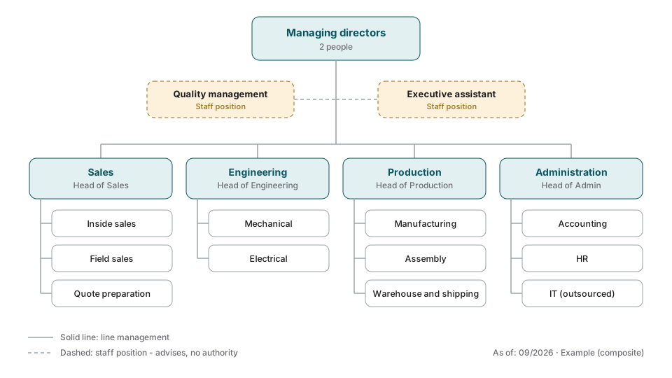
Download the template: Org chart template for PowerPoint (.pptx) - a line-and-staff org chart with managing directors, two staff positions and four departments, plus the role overview and the four types of org chart on separate slides. Free, no sign-up. Would you like to have it built from conversations with your team instead? Try one interview for free
This is what the template looks like filled in, using a composite machine-building company with 80 employees, organized as line-and-staff:
In PowerPoint, open the template, rename the boxes and copy or delete whatever you don't need. Take the names from the table of responsibilities.
For Word there are two routes. You copy the diagram from the PowerPoint template and paste it into your Word document. Or you create your own org chart under "Insert" and "SmartArt" as described above.
Keeping it current: how an org chart stays accurate
An org chart stays current when one named person updates it with every personnel change, or when it grows out of a source that updates along the way. It is a snapshot of an organization that keeps moving. People come and go, teams get restructured, and some roles move from one person to the next in everyday work.
After six months a fair amount has often changed, including the insights from the conversations in step 3. Three habits help:
- One person owns the upkeep, for example the executive assistant or HR.
- Every hire, departure and role change triggers an update, ideally as an item on the joiner and leaver checklist.
- The "as of" date is visible on the org chart, and there is exactly one valid file.
HR software takes this work off your hands for the formal hierarchy. The layer beneath it, who actually does what and knows what, is maintained by hand there as well. It can be kept current through regular conversations about people's own work, as in AI process documentation. How the org chart fits into a larger initiative is covered in the guide on implementing knowledge management.
Conclusion
For a one-off presentation, an org chart template in PowerPoint or Canva is enough, such as the template from this article. For larger org charts, draw.io or Lucidchart offer more comfort, with one named person looking after maintenance. HR software keeps the formal hierarchy current.
The greatest value comes from asking who actually does what. If you would like that question answered on an ongoing basis, a source that updates with every conversation helps. With wissa.ai a free trial package to start with (10 credits, once per company, terms) usually covers a first interview, interviewees don't need an account of their own, the platform is hosted in Germany, with a data processing agreement under Art. 28 GDPR (contract documents in German). Try one interview for free
FAQ
Which org chart software suits small and mid-sized companies?
For most small and mid-sized companies, PowerPoint, Canva or the free draw.io are a good fit. For a one-off presentation, a ready-made template is enough. For larger org charts in regular use, draw.io or Lucidchart with data import work well. HR software like Personio keeps the hierarchy current automatically if it's in use anyway. Who actually carries which tasks only becomes clear by asking the employees themselves.
Can I create an org chart online for free?
Yes. draw.io (diagrams.net) is completely free, runs in the browser and exports PDF, PNG and SVG. Canva and Lucidchart have free versions with org chart templates that are usually enough for a single org chart. If you use Microsoft 365, you can work with SmartArt in Word or PowerPoint without any extra tool. The PowerPoint template for this article is free as well.
How do I create an org chart in Word?
In Word, open the "Insert" tab, click "SmartArt" and choose the "Organization Chart" layout under "Hierarchy". Enter names and roles in the text pane, and indented lines move one level down. You add more boxes by right-clicking and choosing "Add Shape". Beyond about 30 boxes, draw.io is the more comfortable choice.
What belongs in an org chart with responsibilities?
For each role: department, tasks in three to five keywords, the person who holds it, the reporting line and the back-up. It works best as a table with one row per role, because one person often has several roles. Empty back-up cells show where knowledge depends on a single person.
Are there free org chart templates?
Yes. This article comes with a free org chart template as a PowerPoint file, with a line-and-staff chart and a role overview, no sign-up needed. Beyond that, PowerPoint and Word ship with built-in hierarchy layouts via SmartArt, and Canva and draw.io offer free org chart templates too. For small companies up to about 30 people, that's entirely sufficient. Staying current also takes regular maintenance.
How often should an org chart be updated?
Ideally with every personnel or structural change, which in practice means continuously. In practice, org charts often get updated only occasionally, for example before an audit or bank meeting. That's why it pays to assign the upkeep firmly to one person and tie it to hires and departures, or to switch to a source that updates continuously.
What is the difference between an org chart and a role overview?
The org chart shows the formal structure: departments, positions, reporting lines. A role overview shows which packages of work exist and who actually carries them, independent of position. In mid-sized companies, one person often carries many roles, and some roles are carried by nobody. Both views together show where absence risks and overload sit.
Does the works council need to be involved in creating an org chart?
A plain org chart is generally not subject to codetermination. Software that processes employee data is different: if it is objectively capable of monitoring behavior or performance, the works council has a right of codetermination under section 87(1) no. 6 of the German Works Constitution Act, and that regularly applies to HR software and AI interview tools as well. Standardized surveys about personal skills can also fall under section 94. So involve the works council early and, where in doubt, settle the details with your legal counsel. Transparency about purpose, data use and deletion periods builds trust.
What types of org charts are there?
There are four basic forms: the line organization (every position has exactly one superior), the line-and-staff organization (line plus advisory staff positions), the multi-line organization (several functional superiors per position) and the matrix organization (function and project cross). On top of that there is the flat organization with hardly any levels. In mid-sized companies line-and-staff is very widespread, often supplemented by a matrix for individual large projects.
Sources
- Henri Fayol: Administration industrielle et générale, Paris 1916 - the principle of unity of command (line organization)
- Frederick W. Taylor: Shop Management, Transactions of the ASME, 1903 - functional foremanship as the origin of the multi-line organization
- ISO 9001:2015, clause 5.3 "Organizational roles, responsibilities and authorities"
- German Works Constitution Act (BetrVG), section 87(1) no. 6 - codetermination on technical systems intended to monitor behavior or performance (under Federal Labour Court case law, objective capability is enough)
- German Works Constitution Act (BetrVG), section 94 - works council consent to personnel questionnaires